UIFeedback Config Elements
Element Overlay section
The element overlay section is responsible for the spatial coordinates of the objects.
Source
The source attribute tells defines the referential source for the coordinates.
Values |
cutout |
Future possibility: "source:" "scanResult" |
|
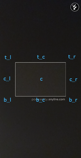
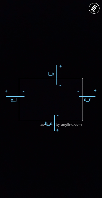
Anchor
The anchor attribute allows defining the bounds of the source.
Values |
top_left |
top_center |
top_right |
center_left |
center |
center_right |
bottom_left |
bottom_center |
bottom_right |
|
|
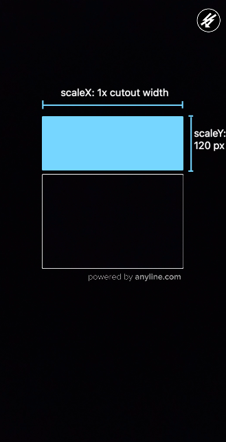
SizeDimension
The sizeDimension attribute is responsible for setting the size of the overlay. It is composed by components x and y, one for each axis.
-
scaleValue: aFloatvalue to be used with thescaleTypefor positioning overlays. -
scaleType: Enum class containing possible values for scaling overlays.
Values |
Description |
none |
No scaling |
overlay |
Scale based on source size |
fixed_px |
Fixed size in pixels |
keep_ratio |
Keep original view size ratio |
|
|
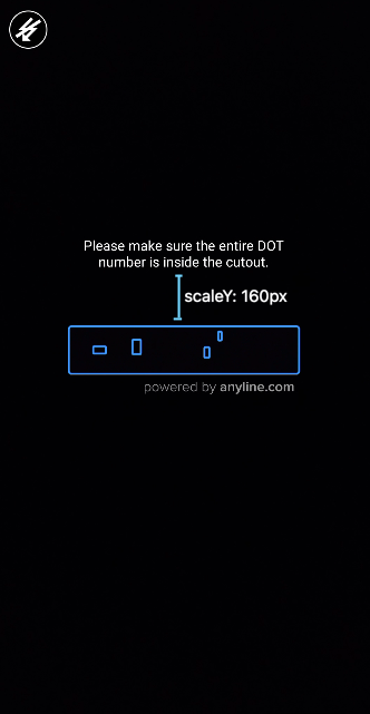
OffsetDimension
The offsetDimension attribute is responsible for shifting the positions of the overlay. It contains the same structure of sizeDimension (two components for x and y, both with scaleValue and scaleType.
|
|
|
| Offset Dimension pushes to anchor direction. |
Element Attributes section
The element attributes section is responsible to apply additional attributes to the element.
-
textAlignment: an enum string value that corresponds to text alignment (only applicable forcontentType:text). Possible values: left, right, center. Default value: center. -
textColor: astringvalue (HEX RGB) corresponding to text color (only applicable forcontentType:text). -
backgroundColor: astringvalue (HEX RGB) corresponding to background color. -
imageScaleType: an enum string value that corresponds to image scale type (only applicable forcontentType:image). Possible values: fit_center, center, center_crop, fit_xy. Default value: fit_center.
Element Content section
The element content section is responsible for filling the elements with content.
-
contentValue: astringvalue that is going to fill the element depending on itscontentType.
contentType |
contentValue |
image |
Drawable resource |
sound |
Sound asset |
text |
Text string |
-
durationMills: anintegervalue in milliseconds corresponding to the duration the content will be shown. A zero-value keeps the content always visible. Default value:0 -
priorityLevel: anintegervalue (between 0 and 100) indicating the priority of the content. Highest priority: 0; lowest priority: 100. The lower the value, the higher the priority this content has over other contents. E.g., in case a trigger tries to replace the contentValue with newer content with a lower priority, it shall be ignored. Default value:1
|
|
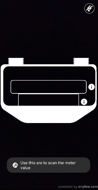
| The content for the element guide_image is dismissed after 3 seconds while the content for the element instruction_text keeps being shown for the whole scanning process. |
Element Trigger section
The element trigger section is responsible to apply changes to the element based on advanced ScanPlugin responses during the scan process.
-
scanInfo: an array ofWhenScanInfoobjects. -
runSkipped: an array ofWhenRunSkippedobjects.
Element WhenScanInfo Trigger section
The ScanInfo trigger watches ScanPlugin.scanInfoReceived events for specific variable names and values.
-
varNameEquals: astringvalue that refers to the variable to be watched. -
varValueEquals: astringvalue that refers to the value expected. -
applyDefaultContent: abooleanvalue that makes the defaultContent to be applied to the element when triggered. -
applyContentInstead: anElementContentobject that will be applied to the element when triggered. -
applyDefaultAttributes: abooleanvalue that makes the defaultAttributes to be applied to the element when triggered. -
applyAttributesInstead: anElementAttributeobject that will be applied to the element when triggered.
Element WhenRunSkipped Trigger section
The RunSkipped trigger watches ScanPlugin.runSkippedReceived events for specific codes.
-
codeEquals: anintegervalue that refers to the code expected. -
applyDefaultContent: abooleanvalue that makes the defaultContent to be applied to the element when triggered. -
applyContentInstead: anElement Contentobject that will be applied to the element when triggered. -
applyDefaultAttributes: abooleanvalue that makes the defaultAttributes to be applied to the element when triggered. -
applyAttributesInstead: anElement Attributeobject that will be applied to the element when triggered.
|
|
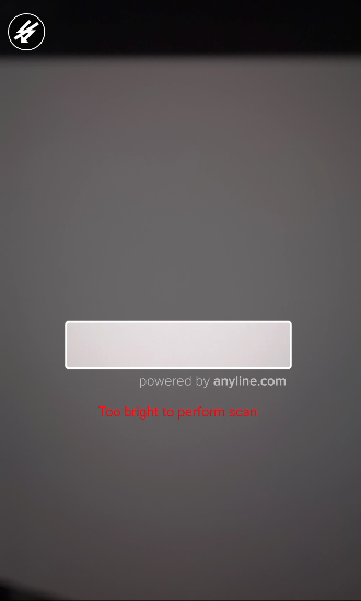
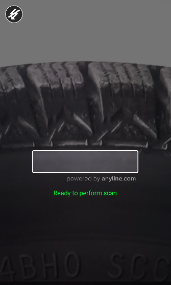
| The content and attributes for the element lighting_feedback_text are updated for every $lightingCondition with TOODARK and TOOBRIGHT values but return to their default state with GOOD value. |
Element section
The element section refers to the concrete implementation of the element and all of its properties.
-
id: astringvalue used to refer the element. -
contentType: astringenum value corresponding to the associated type of view object.
contentType |
View Type |
image |
ImageView |
sound |
(no view) |
text |
TextView |
-
overlay: anElementOverlayobject containing the constraints for positioning the element on the screen. -
trigger: anElementTriggerobject containing the constraints for watching and applying dynamic content. -
defaultAttributes: anElementAttributeobject containing the default attributes to be applied to the element on its creation. -
defaultContent: anElementContentobject containing the default content to be applied to the element on its creation. -
tag: astringvalue that can be used to add additional information to the element. -
clickable: abooleanvalue that sets whether the element is responding to onClick events or not.
|
|
Listening to UIFeedback click events
To receive click notifications from clickable elements you must listen to the onUIFeedbackOverlayViewClickedEvent event on the ScanView.
scanView.onUIFeedbackOverlayViewClickedEvent = Event { data ->
    val scanViewPlugin: ScanViewPlugin = data.first
    val elementEventContent: UIFeedbackOverlayViewElementEventContent = data.second
    if (elementEventContent.element.tag.isNotEmpty()) {
        Toast.makeText(this,
            elementEventContent.element.tag,
            Toast.LENGTH_SHORT)
            .show()
    }
}