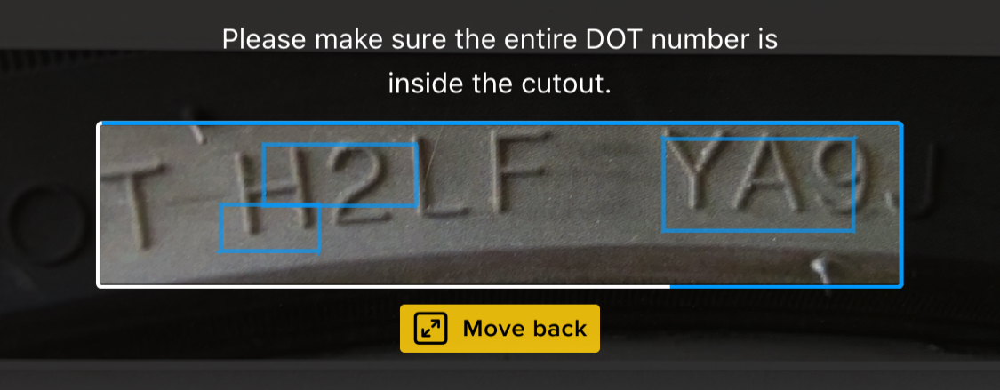
UI Feedback
UI feedback elements can enhance the scanning experience by informing the user about environmental conditions detected during scanning. Incorporating such elements during the scanning experience can be beneficial in many ways. For example, visual cues (such as images or text) next to the cutout within the scan view can guide the user on how or what to scan.
Quick Start
import { init, uiFeedbackPresets } from '@anyline/anyline-js';

const anyline = init({
  license: 'YOUR_LICENSE_KEY',
  element: document.getElementById('scanner-root'),
  preset: 'tin',
  viewConfig: {
    uiFeedback: {
      dynamic: uiFeedbackPresets.tin,
      static: {
        instructionText: "Place entire TIN inside the cutout"
      }
    }
  }
});
Feedback Types
Static Feedback
Displays constant instruction text above the cutout. Available for all presets.
viewConfig: {
  uiFeedback: {
    static: {
      instructionText: "Your instruction here"
    }
  }
}
Dynamic Feedback
Shows real-time visual guidance based on environmental conditions. Dynamic feedback is currently available for:
-
TIN / DOT TIN – use
uiFeedbackPresets.tinwithpreset: 'tin'orpreset: 'tin_dot' -
VIN with user guidance – use
uiFeedbackPresets.vintogether withpreset: 'vin_with_user_guidance'
Lighting feedback:
Available for: tin, vin_with_user_guidance
-
Too dark - when ambient light is insufficient
-
Too bright - when light causes glare
Distance feedback:
Available for: tin, vin_with_user_guidance
-
Move closer - when device is too far
-
Move back - when device is too close
Check Digit Validation
Available for: vin_with_user_guidance
-
Invalid content - when check digit is not valid
|
This feedback only appears when check digit validation is enabled. Make sure |
Custom Images
Provide your own images for feedback:
import { init, UiFeedbackConfig } from '@anyline/anyline-js';

const customUiConfig: UiFeedbackConfig = {
  presetName: 'tin',
  lighting: {
    imageTooDark: {
      src: '/path/to/dark-icon.png',
      alt: 'too dark'
    },
    imageTooBright: {
      src: '/path/to/bright-icon.png',
      alt: 'too bright'
    }
  },
  distance: {
    imageMoveCloser: {
      src: '/path/to/closer-icon.png',
      alt: 'move closer'
    },
    imageMoveBack: {
      src: '/path/to/back-icon.png',
      alt: 'move back'
    }
  }
};

const anyline = init({
  license: 'YOUR_LICENSE_KEY',
  element: document.getElementById('scanner-root'),
  preset: 'tin',
  viewConfig: {
    uiFeedback: {
      dynamic: customUiConfig,
      static: {
        instructionText: "Scan tire identification number"
      }
    }
  }
});
Make sure to specify tin or vin_with_user_guidance, based on which preset name you are using. This will also enable compiler checks for which attribute is available for which presetName.
|
Bundled Assets
The following image assets, along with their default alt text, are included with the SDK bundle and can be used with your app by referencing these names within the preset:
| Image | Reference |
|---|---|

|
|

|
|

|
|

|
|

|
|
The default bundled assets ship with Title Case alt text (for example Too bright). Override the alt value if your accessibility guidelines require different phrasing.
|
See Also
-
ViewConfig Reference - Visual configuration options
-
Plugin Configuration - Configuration options
-
API Reference - Complete API documentation
-
TIN Technical Capabilities - TIN plugin details
-
General Examples - Code examples
