Default UI - Elements
In the previous section we talked about the Default UI as a whole.
In this section we’ll break down each element of the Default UI, their names and purposes.
Focus Point Tooltip
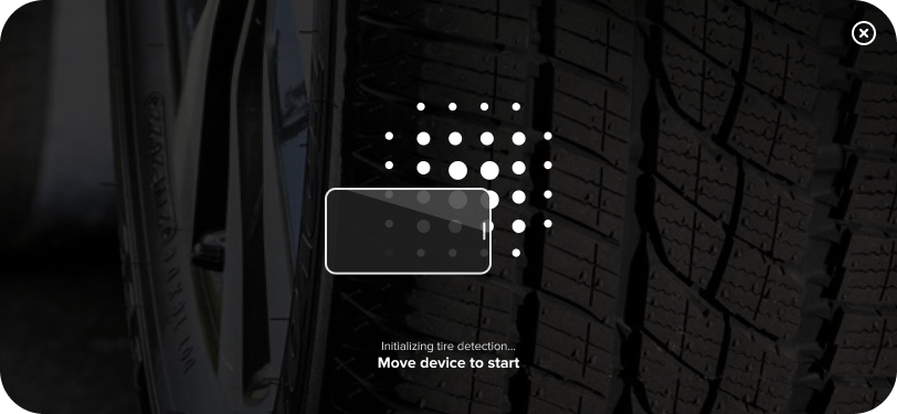
Purpose:
Instructs the user on how to move the device in order to find a surface to scan.
Class type:
FocusPointTooltipConfig
Properties:
| Name | Summary |
|---|---|
text |
Text displayed when the focus has not yet been found. Default value is "Move your device slowly back and forth to detect the tire.". |
smallText |
Small text displayed above the bold caption, when the focus has not yet been found. Default value is "Initializing tire detection…". |
| This element is shared with the Classic UI. |
Tap to Start Scanning Tooltip
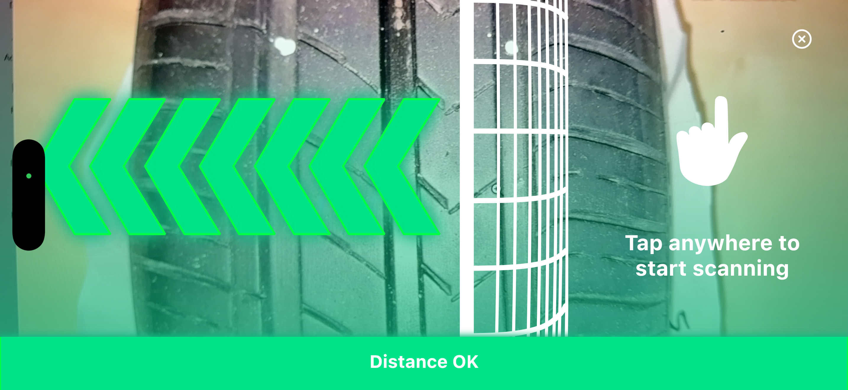
Purpose:
Once the device is correctly positioned, informs the user that they can tap the screen to start scanning. Shows different visual feedback based on distance status.
Class type:
TapToStartScanningTooltipConfig
Properties:
| Name | Summary |
|---|---|
textOk |
Text displayed when the user can start the scan process. Default value is "Tap anywhere to start scanning". |
textNotOkMetric |
Text displayed when the user needs to move the device to the correct distance. Default value is "Align the tire shoulder with the overlay". |
textNotOkImperial |
Text displayed when the user needs to move the device to the correct distance. Default value is "Align the tire shoulder with the overlay". |
| Default UI uses different default text than Classic UI. The Default UI only allows tap-to-start, not tap-to-cancel during scanning. |
Countdown
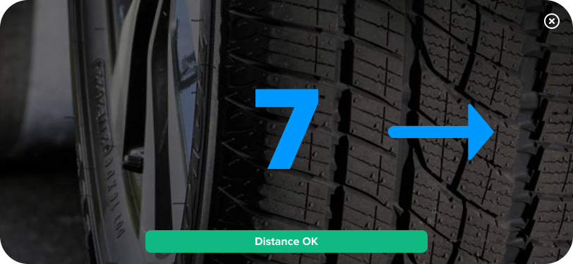
Purpose:
Displays animated arrows and countdown numbers during the scanning process. Features 7 overlapping arrows that progressively fill based on countdown with smooth transitions, creating a continuous arrow effect. The direction of the arrows adapts to the scan direction (left-to-right or right-to-left). The color of the arrows changes based on distance status to provide real-time feedback.
| Not customizable - This component is integral to the Default UI appearance and cannot be configured. |
Distance Indicator
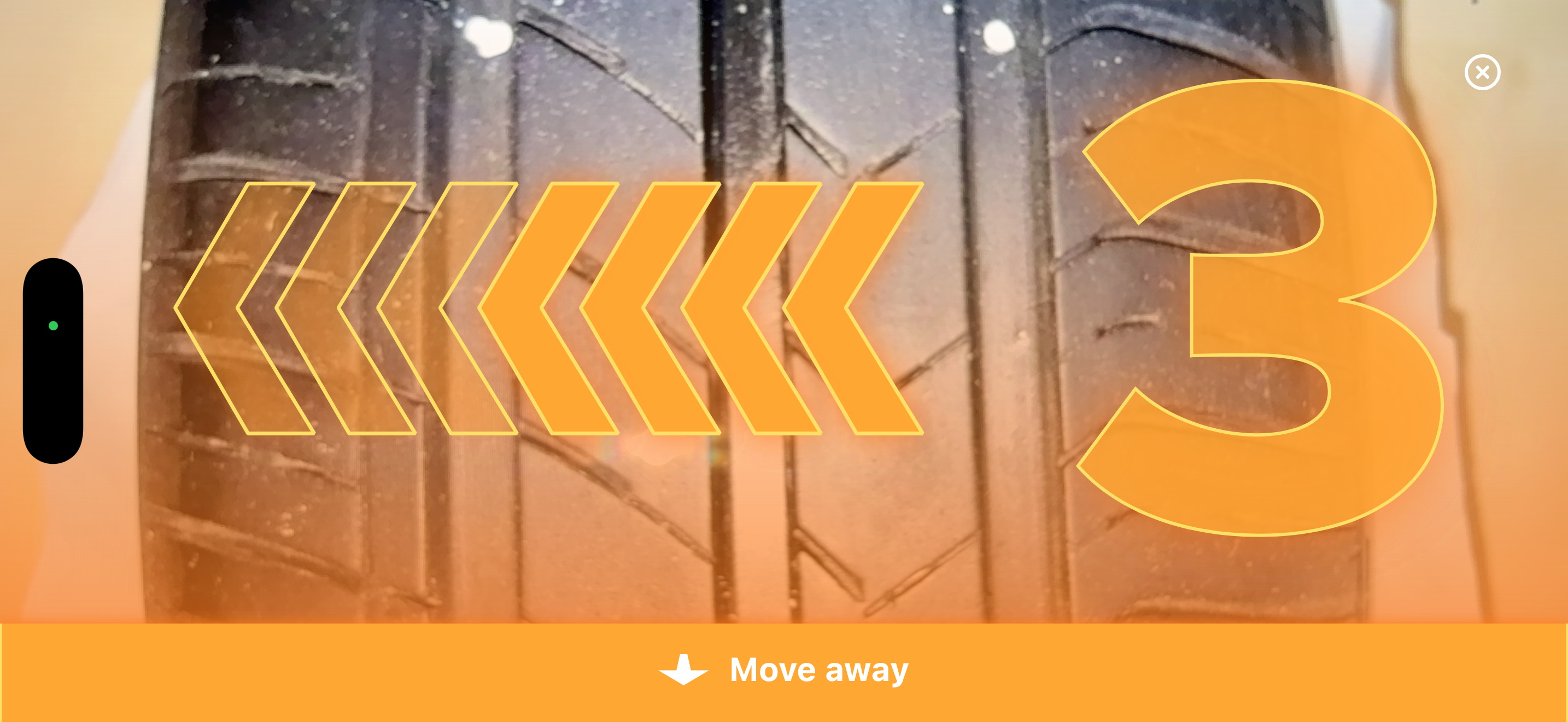
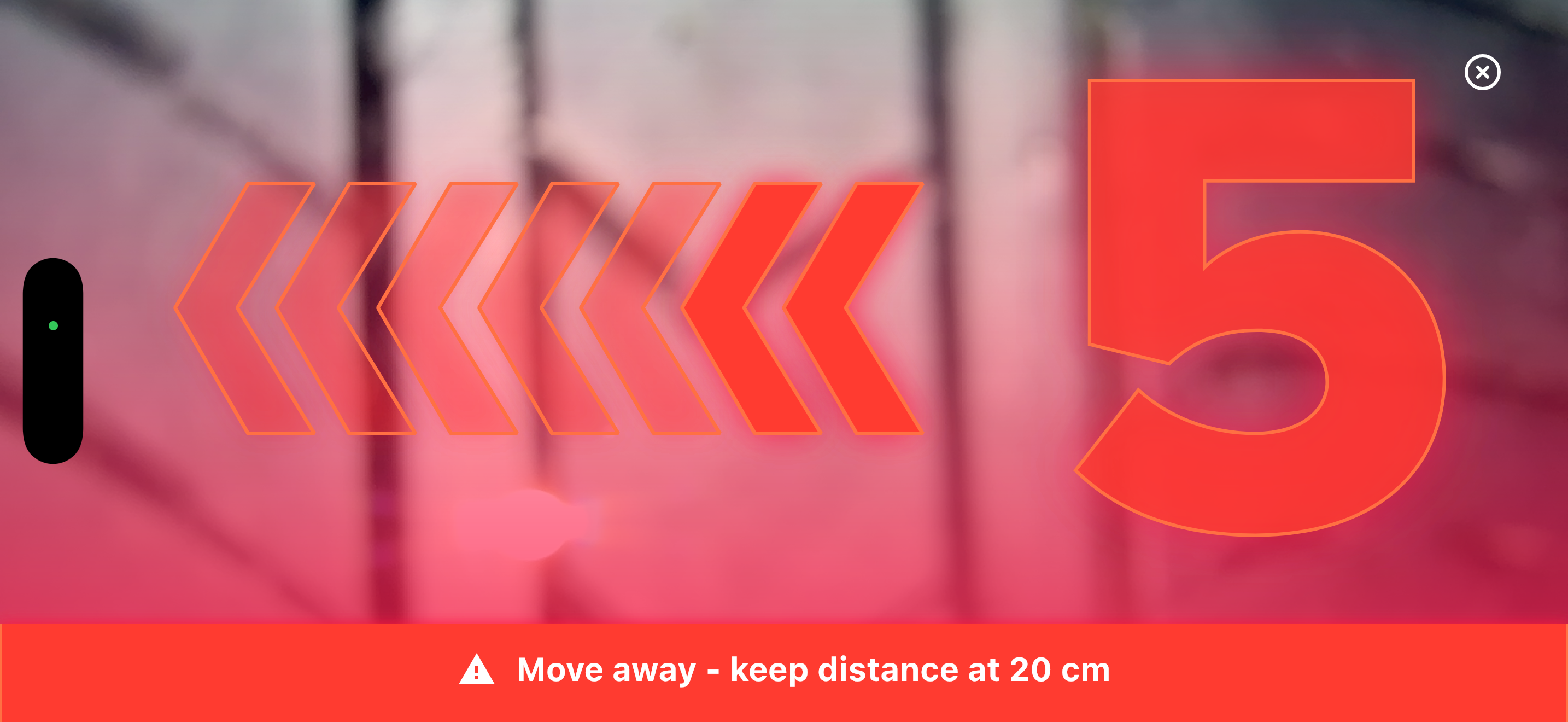
Purpose:
Displays as a full-width bar at the bottom of the screen. Shows real-time distance information and guidance text, with color changing based on distance status. Includes directional icons (move closer/away arrows or warning icon) when appropriate.
Possible states: "Too close" - Red with warning, "Close" - Orange with move away arrow, "Distance OK" - Green, "Far" - Orange with move closer arrow, "Too far" - Red with warning.
Class type:
DistanceIndicatorConfig
Properties:
| Name | Summary |
|---|---|
textMoveAway |
Text displayed when the user needs to move away from the tire. Default value is "Move away". |
textMoveCloser |
Text displayed when the user needs to move closer to the tire. Default value is "Move closer". |
textOk |
Text displayed when the user is correctly positioned to scan the tire. Default value is "Distance OK". |
Upload View
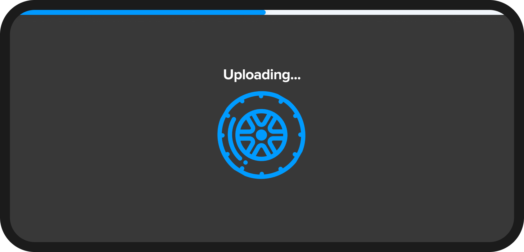
Purpose:
Informs the user that the upload process is currently in progress.
Class type:
UploadViewConfig
Properties:
| Name | Summary |
|---|---|
text |
Text displayed to inform that the upload is currently in progress. Default value is "Uploading…". |
| This element is shared with the Classic UI. |
Abort Button
Purpose:
At any point in time, enables the user to abort the scan process.
Aborting delivers an AbortedOutcome through the ScanOutcome callback.
| Not customizable - This element is shared with the Classic UI. |
Orientation Warning
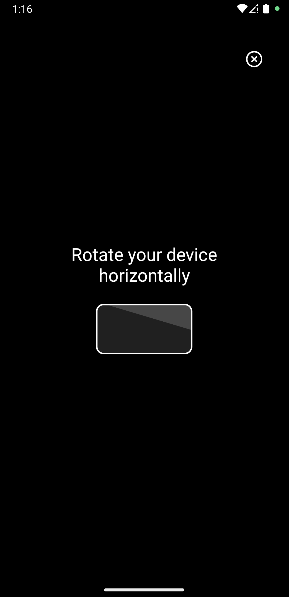
Purpose:
This UI element is shown when the user is holding the device in portrait mode. It signalises to reorient the device to landscape mode for an optimal scan experience.
Class type:
OrientationWarningConfig
Properties:
| Name | Summary |
|---|---|
text |
Text displayed to inform the user about the correct orientation of the device. Default value is "Rotate your device horizontally". |
rotationLockHint |
Text displayed to inform the user to enable rotation on the device. Default value is "Make sure your device’s auto-rotate feature is enabled.". |
| This element is shared with the Classic UI. |
Tire Width Input
(Android Only)
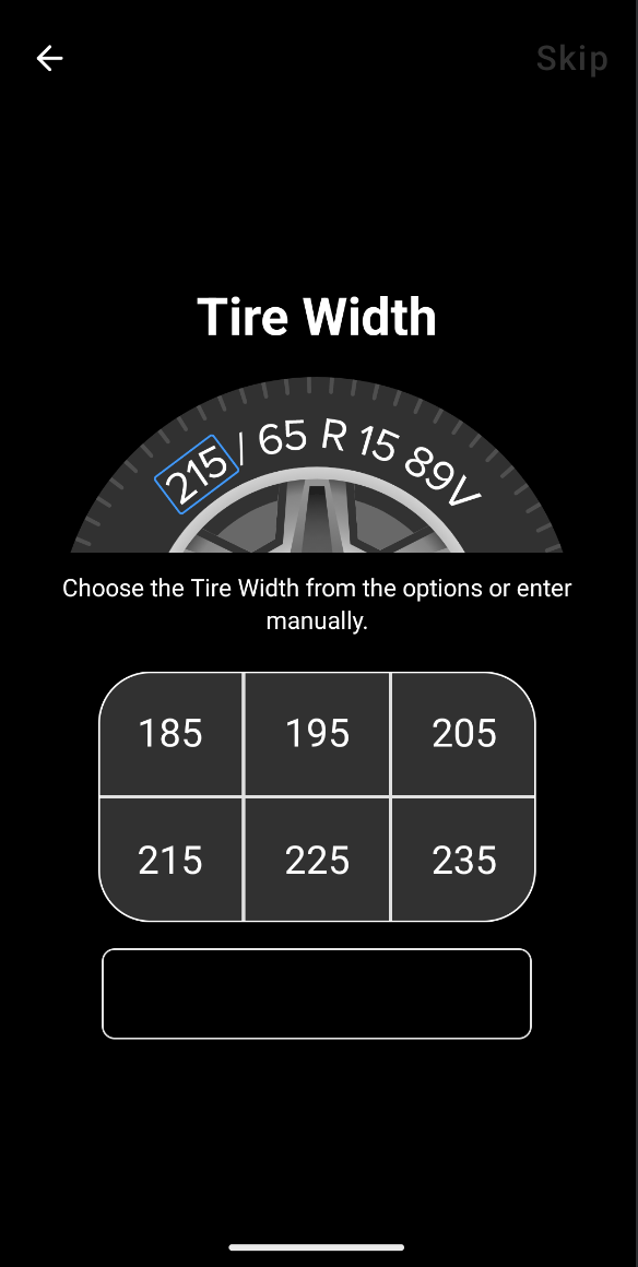
Purpose:
This UI element is shown as soon as the scan starts and enables the user to enter the width of the tire, if one hasn’t been provided yet.
Class type:
TireWidthInputConfig
Properties:
| Name | Summary |
|---|---|
titleText |
Text displayed as the title of this screen. Default value is "Tire Width". |
explanationText |
Text displayed as a short explanation of the screen. Default value is "Choose the Tire Width from the options or enter manually.". |
continueButtonText |
Text for the "Continue" button. Default value is "Continue". |
prefilledTireWidth |
Value for the tire width input field to be prefilled with in millimetres. Default value is null. |
tireWidthRange |
Value limiting the range of the tire width.
Default values: lowerLimit = 100, upperLimit = 500. |
tireWidthOptions |
List of 6 options the user can choose from when selecting a tire width. Default values are [185, 195, 205, 215, 225, 235]. |
|
As this element contains a Text Input field for the Tire Width, you should add the |
| This element is shared with the Classic UI. |
Missing Permission
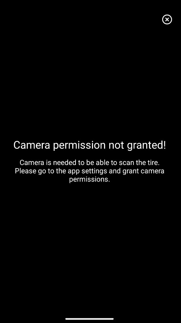
Purpose:
This UI element is shown when the user denies camera permission.
Class type:
MissingPermissionConfig
Properties:
| Name | Summary |
|---|---|
title |
Title displayed when camera permission is not granted. Default value is "Camera permission not granted!". |
text |
Text displayed when camera permission is not granted. Default value is "Camera is needed to be able to scan the tire.\nPlease go to the app settings and grant camera permissions.". |
|
If Default UI is not used, a black screen will be shown when the user denies camera permission. |
| This element is shared with the Classic UI. |